Do Your Interiors Talk About Your Brand Message?
Why interior design uses your corporate identity to create an impact
As interior Designers, we are often at a loss when our clients give us the logo to be used only as a backdrop for the receptionist! You see, the brand “message” talks about who you are, what you stand for, and why people should trust you! We just translate that message into the interior design so that you can create an impression.
Why?
The visual identity of an office is the “first impression” created for anyone who enters, be it your clients, investors or potential talent you’re looking to hire. That is why it is of utmost importance to focus on how you are making them feel.
If you are a law firm but the colors in your interiors are funky and playful – chances are you’ll be taken less seriously. Whereas on the other hand if you are a design firm and have the same interiors – you could be singled out among your competitors as a quirky brand – great! But is that what you really are? Is this your brand identity? How do you want people to recognize you? When your brand identity is defined, and your architect or interior designer can translate that into a visual identity for your office or workplace, it will ring true – and you can answer all of these questions without talking.
From the Interior Design viewpoint, these could be some ways that the personality of your company can be heard, seen and felt!
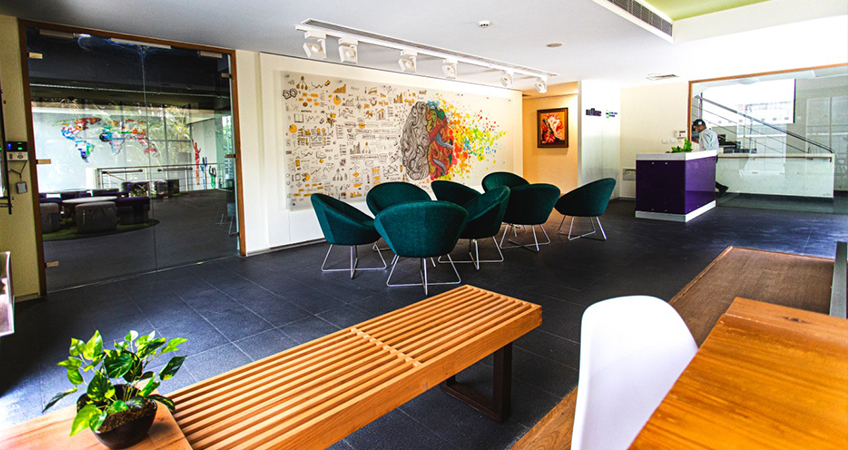
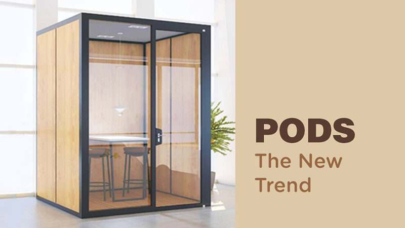
- Layout: Space planning is about the brand. Are you young? Serious? Quiet? Noisy? The brand identity is kept in mind while the function defines the layout. Packed layouts with workstations collected together, for example, tend to create feelings discomfort – of assembly lines, intimidation, suffocation.
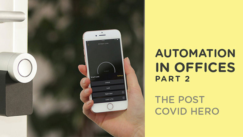
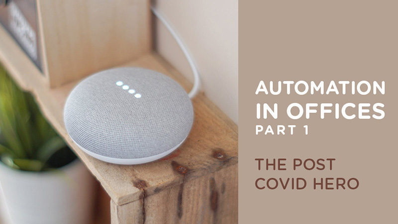
On the other hand, a well-planned open layout makes the space more breathable and promotes focus and comfort. It makes visitors feel welcomed and puts new employees at ease – it also translates the brand identity as open, friendly and considerate. - Technology: How you use technology in your office interiors also defines you as a brand. Use of technology gives the impression of innovation, creativity and movement – automated doors, advanced elevator systems, RFID scanners, coffee machines, watercoolers, etc. help create a distinct environment with a lasting impression. It also translates the ideologies of the company as new age, fast moving and updated!
- Materials: Every material your designer uses to create your office space actually works at reinforcing your brand identity – and conveys your ideology using those materials. It’s not only seeing, but touching the surfaces that affects the mood. For example, a company that works towards the development of organic products must use organic and natural materials for their office space – if they don’t walk the talk, they will be seen as fake! On the other hand, a company that is focused on technological advancement is more likely to use metal, glass, and polymer. Between these two extremes, you need to find the perfect balance to convey who you are.
- Spatial Graphics: When you are able to convey your ideology, you actually generate emotions you want to. Your mission could be out there on a wall! The context here is as important as the content when it comes to spatial graphics. The attention is on what you want to convey and the how is where designers come in.
Different spaces will have different energies:
– Informal areas – lighten the mood!
– Workstation areas – focus and encouragement!
– Breakout areas – promote communication and inspire ideation! - Colors: Different colors tend to make different people feel differently. How you want people to feel about your company will be determined by your brand and how you use colors to complement your brand identity. The colors of your brand and the colors that resonate with your brand could be visually present in your office design, so that the colors become your identity. For example, can you recall the brand color of Apple? Vistara? FedEx? Lufthansa? Target Corp.? Airtel? From the flooring, to furniture to graphics, there are many ways to make your colors talk.
Some color psychology bonus pointers:
– Blue to create comfort, trust, reliance and calm.
– Red to invigorate speed, energy and strength.
-Yellow to create approach, attention and focus.
These are some ways in which you can decide what you want to look like to the outside world – we suggest you take your branding beyond signage, stationary and company communication and make it a part of who you are!


